|
|
||
|---|---|---|
| .. | ||
| css | ||
| design | ||
| images | ||
| js | ||
| screenshots | ||
| .gitignore | ||
| README-orig.md | ||
| README.md | ||
| index.html | ||
| style-guide.md | ||
README.md
Frontend Mentor - Product preview card component solution
This is a solution to the Product preview card component challenge on Frontend Mentor. Frontend Mentor challenges help you improve your coding skills by building realistic projects.
Table of contents
Note: Delete this note and update the table of contents based on what sections you keep.
Overview
The challenge
Users should be able to:
- View the optimal layout depending on their device's screen size
- See hover and focus states for interactive elements
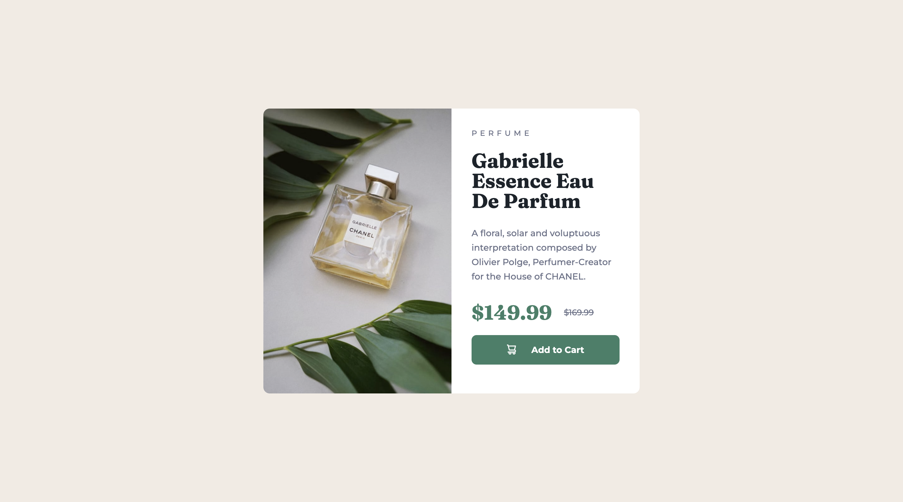
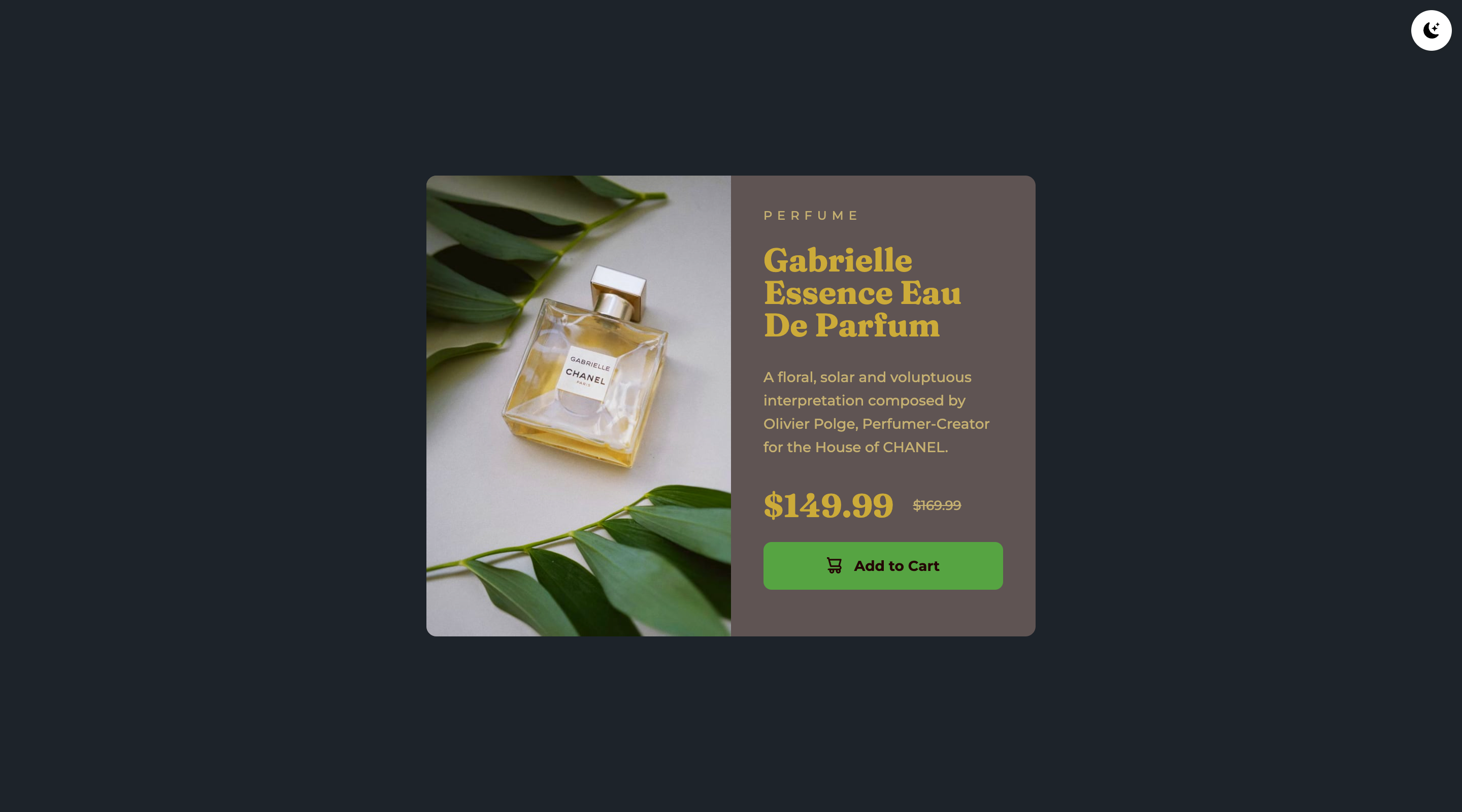
Screenshot
Links
- Solution URL: Github
- Live Site URL: tarasis.github.io
My process
Standard for me so far. Set up CSS properties for most things. Then I built the mobile version of the page. Made minor changes for the desktop version. Added a Light/Dark switcher, just to show updating the variables to change the colors.
Built with
- Semantic HTML5 markup
- CSS custom properties
- Flexbox (for some alignment)
- CSS Grid (just for putting in the middle of the page)
- Mobile-first workflow
Author
- Website - Robert McGovern
- Frontend Mentor - @tarasis
- Twitter - @tarasis
Acknowledgments
Two articles gave me the setup for the Light / Dark switcher I've set up. The first by Musthaq Ahamad gave the JavaScript, but I didn't want to have it as a sliding button and with using a class for dark mode. For handling that I used ideas from Luke Lowrey's implementation, using data attributes.


