|
|
||
|---|---|---|
| .. | ||
| css | ||
| design | ||
| images | ||
| screenshots | ||
| .gitignore | ||
| README-orig.md | ||
| README.md | ||
| index.html | ||
| reviewing-other-solutions.md | ||
| style-guide.md | ||
README.md
Frontend Mentor - NFT preview card component solution
This is a solution to the NFT preview card component challenge on Frontend Mentor. Frontend Mentor challenges help you improve your coding skills by building realistic projects.
Table of contents
Note: Delete this note and update the table of contents based on what sections you keep.
Overview
The challenge
Users should be able to:
- View the optimal layout depending on their device's screen size
- See hover states for interactive elements
Screenshot
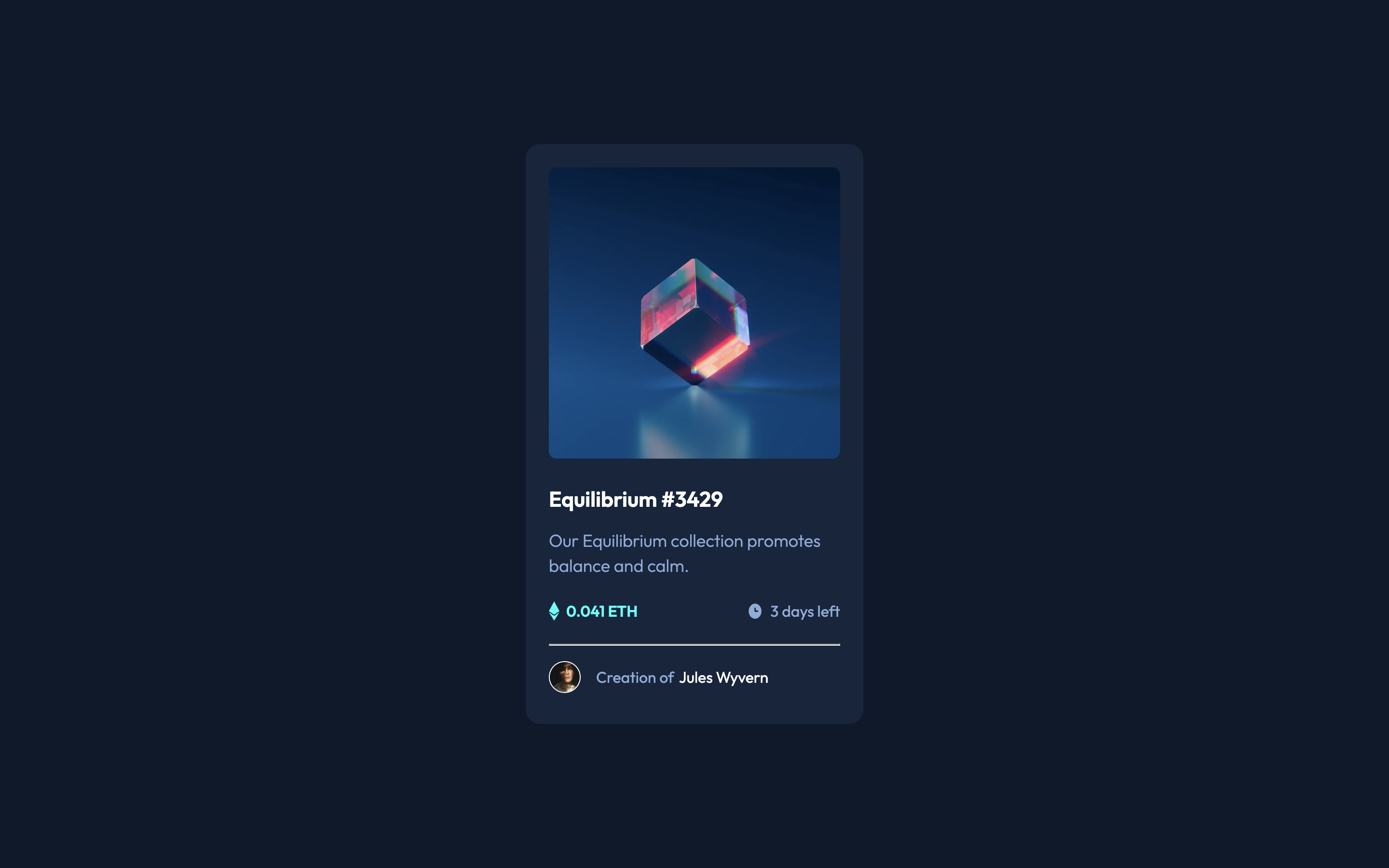
Screenshots covering the mobile and desktop versions, and one showing the mobile version with active hover states on image, header, and name.
Links
- Solution URL: Github
- Live Site URL: tarasis.github.io
My process
Set up CSS properties as if it could be themed. So in theory you can tweak the properties and the design will respond.
Then I tagged, and built the mobile version first.
For the desktop, I tweaked some of the properties, and then changed margins per design.
The trickiest part I found to do was the hover over the image preview. This I solved by using the ::after pseudo element, and layering the background color and svg image on top of the preview image.
Built with
- Semantic HTML5 markup
- CSS custom properties
- Flexbox
- CSS Grid
- Mobile-first workflow
What I learned
That having an image inside of an a tag, means the a is 4px larger than expected. According to this stackoverflow answer it is because "The image is display: inline so it is treated like a character and sits on the baseline. The gap is caused by the space provided for the descender (which you find on letters like j, g, y and p).".
The suggest fix is to set vertical-align: bottom; for the img. Another option is to set the img to display: block; however other answers suggest that can break things.


