 Robert McGovern
48254efc6c
Robert McGovern
48254efc6c
|
||
|---|---|---|
| .. | ||
| css | ||
| design | ||
| images | ||
| screenshots | ||
| .gitignore | ||
| README-orig.md | ||
| README.md | ||
| index.html | ||
| style-guide.md | ||
README.md
Frontend Mentor - FAQ Accordion Card
This is a solution to the FAQ Accordion Card. Frontend Mentor challenges help you improve your coding skills by building realistic projects.
Table of contents
Overview
The challenge
Users should be able to:
- View the optimal layout for the site depending on their device's screen size
- See hover states for all interactive elements on the page
These are the design references

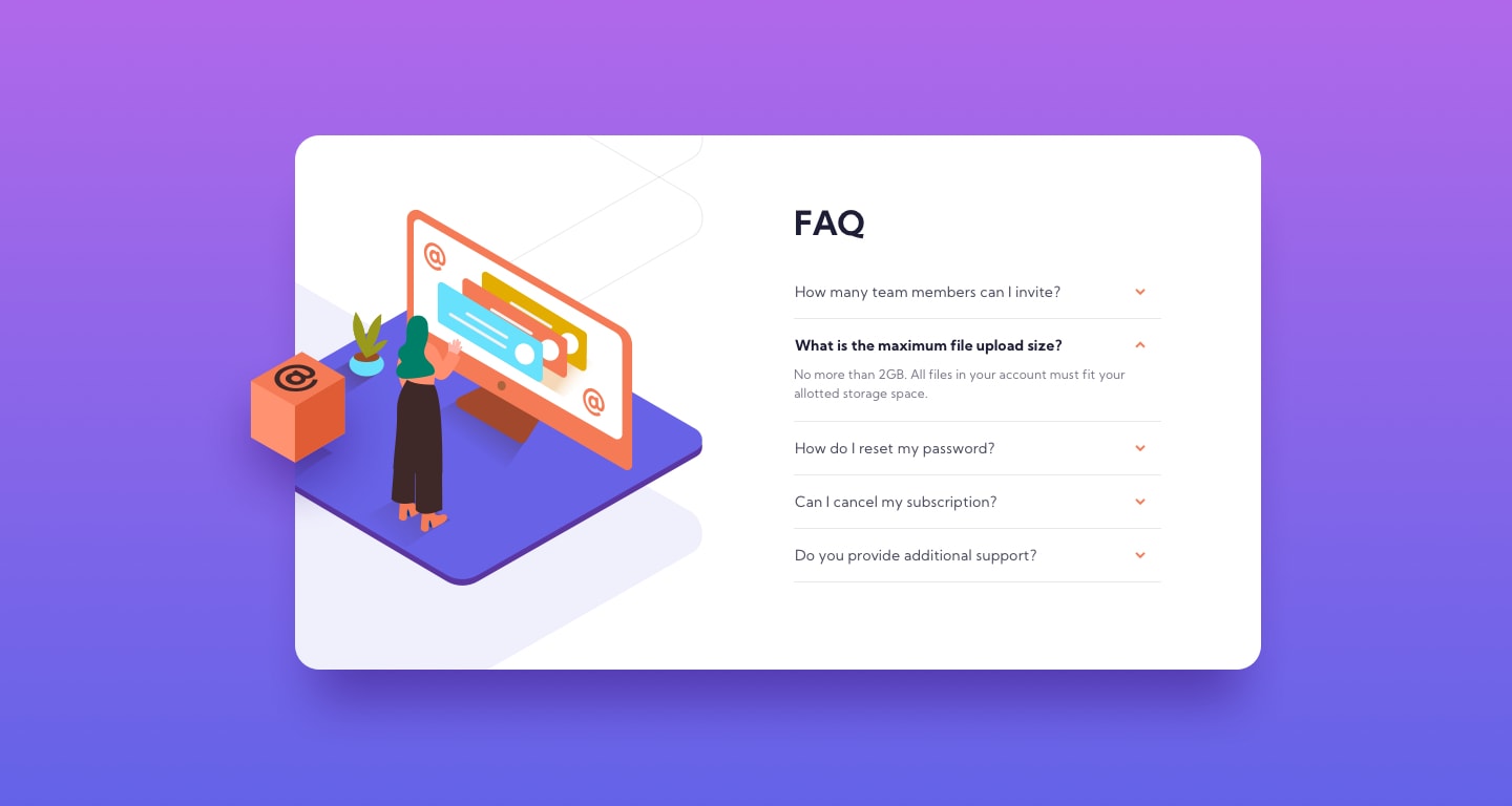
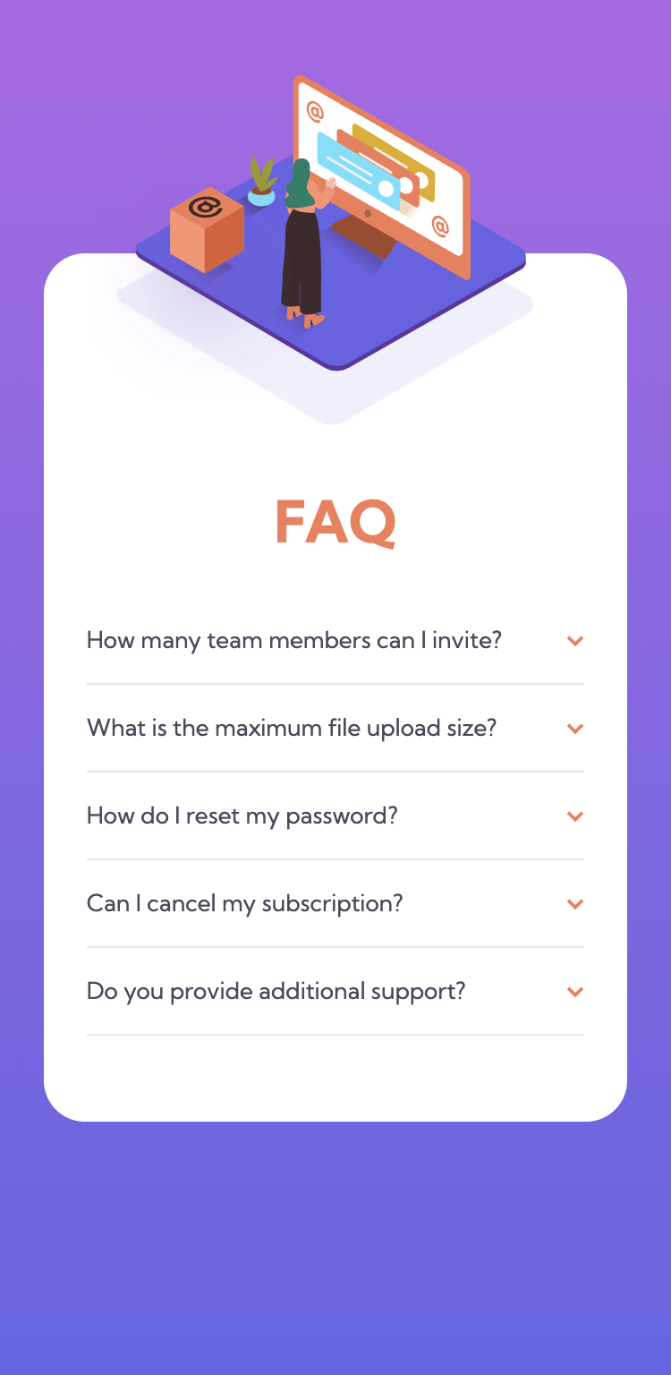
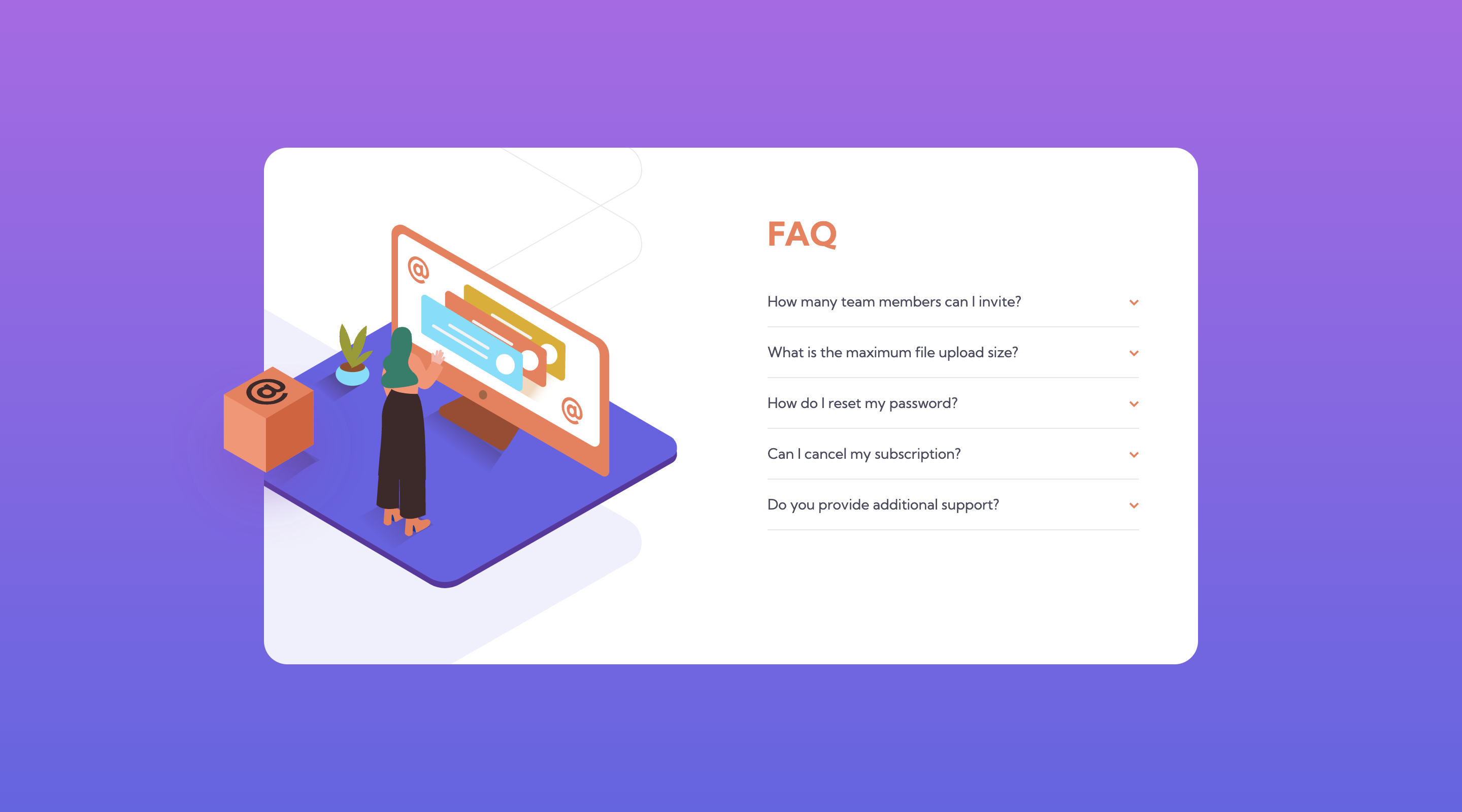
Screenshot
Screen shots of the finished Mobile & Desktop versions with and without the active state


Links
- Solution URL: Github
- Live Site URL: tarasis.github.io
My process
I built out the mobile version first, with the full intention of making it a responsive design that would scale the mobile version till it got to the desktop size and then flip to the desktop version. Unfortunately I couldn't get the placement and scaling to work as I wanted; particularly with regards to the desktop version.
In the end I sought out a someone else's solution to get an idea of how to do the desktop images. This was the first time I had worked with using 3 images layered on top of each other, and I found it difficult.
As I used a disclosure animation I made sure to use @media (prefers-reduced-motion) {} to disable the animation for those that need it.
Built with
- Semantic HTML5 markup
- CSS custom properties
- Flexbox
- CSS Grid
- Mobile-first workflow
What I learned
That I could use Detail / Summary to handle the questions in HTML & CSS rather than use JavaScript.
Continued development
Need to spend some more time practicing placement of images when there are multiple images that are supposed to be layer.
Useful resources
- MDN Detail - Provided how to do the summary and detail without having to use JavaScript.
Author
Acknowledgments
I want to thank Bob Matyas for his codepen, which gave the tip that I needed for handling the placement of the desktop images.