|
|
||
|---|---|---|
| .. | ||
| css | ||
| design | ||
| images | ||
| screenshots | ||
| .gitignore | ||
| README-orig.md | ||
| README-template.md | ||
| README.md | ||
| index.html | ||
| style-guide.md | ||
README.md
Frontend Mentor - Social proof section solution
This is a solution to the Social proof section challenge on Frontend Mentor. Frontend Mentor challenges help you improve your coding skills by building realistic projects.
Table of contents
Overview
The challenge
Users should be able to:
- View the optimal layout for the section depending on their device's screen size
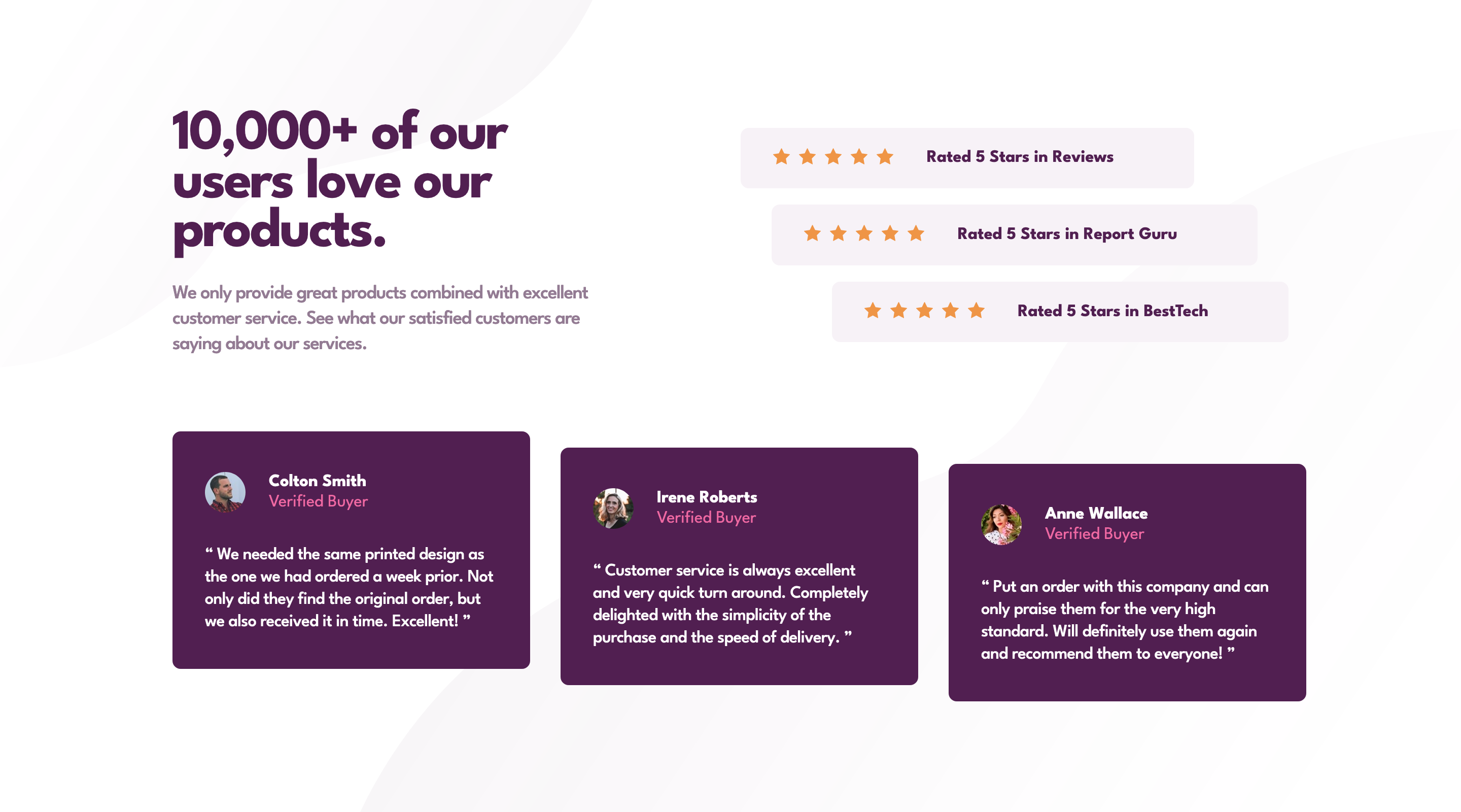
Screenshot
Links
- Solution URL: Tarasis on Github
- Live Site URL: tarasis.github.io
My process
As usual, I started Mobile first. I setup CSS properties for colors, typography and such. After a bit I realised that the font needed was different from when I originally downloaded the starter kit for this challenge. Which meant that my variables were off.
Once I'd finished the mobile version, I re-arranged the HTML slightly because I forgot to make a top and bottom section.
I had little problem with the alignments for the ratings and reviews, but I did end up waisting an hour chasing desktop alignment with design image. I just couldn't quite nail it.
I also played a bit with where the desktop version should start.
Built with
- Semantic HTML5 markup
- CSS custom properties
- Flexbox
- CSS Grid (only for positioning in the middle of the page )
- Mobile-first workflow
What I learned
To check for updated files.
Don't chase perfection.
Continued development
Practice practice and practice.
Author
- Website - Robert McGovern blog
- Frontend Mentor - @tarasis
- Twitter - @tarasis

