 Robert McGovern
2d01d6acaa
Robert McGovern
2d01d6acaa
|
||
|---|---|---|
| .. | ||
| css | ||
| design | ||
| images | ||
| .gitignore | ||
| README-template.md | ||
| README.md | ||
| index.html | ||
| solution-desktop.jpg | ||
| solution-mobile.jpg | ||
| style-guide.md | ||
README.md
Frontend Mentor - Stats preview card component solution
This is a solution to the Stats preview card component challenge on Frontend Mentor. Frontend Mentor challenges help you improve your coding skills by building realistic projects.
Table of contents
Note: Delete this note and update the table of contents based on what sections you keep.
Overview
The challenge
Users should be able to:
- View the optimal layout depending on their device's screen size
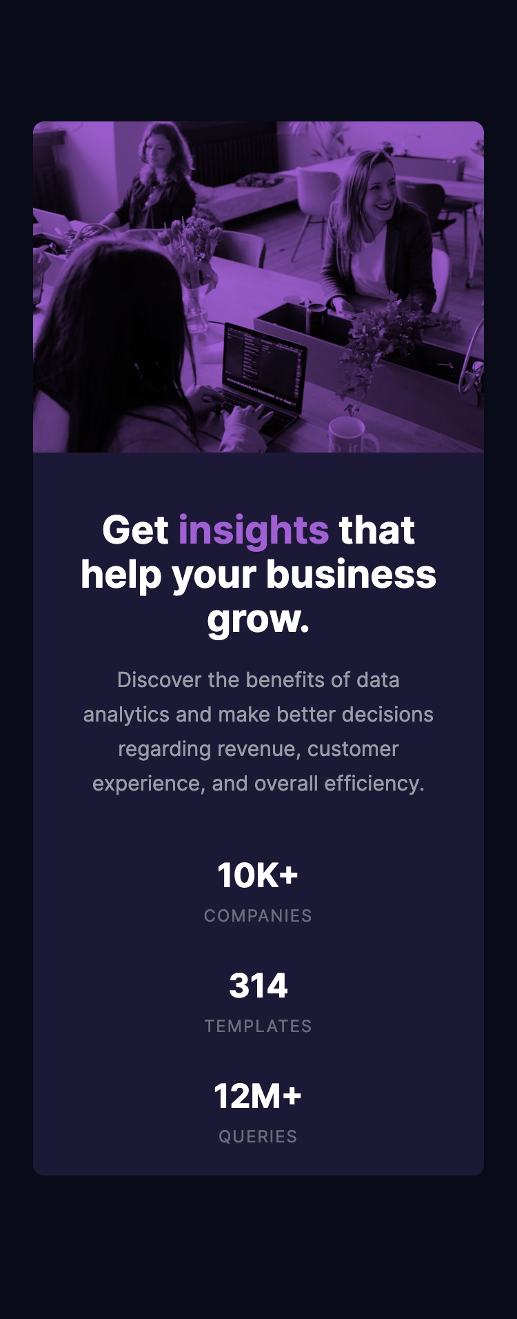
Screenshot
Two screenshots, the first is the Desktop solution, then the mobile solution. The mobile is the closest, I decided not to chase doing getting the Desktop one spot on.

Links
- Solution URL: Solution on GitHub
- Live Site URL: Live Site
My process
This was a little tricky just from the point of view that I hadn't done any HTML/CSS dev / study in 9 months. So it was a case of trying to remind myself of various options that I could do.
Built with
- Semantic HTML5 markup
- CSS custom properties
- Flexbox
What I learned
The main thing was to just let my solution go. In previous ones I would iterate lots to make it as close as I felt I could make it.
As I did most of this one a couple of weeks ago and forgot to take notes I can't really comment on anything else I learnt.
Author
- Website - Tarasis.net
- Frontend Mentor - @tarasis
- Twitter - @tarasis
Acknowledgments
Matt at Frontend Mentor for coming up with the idea of challenges like this.