1.3 KiB
6th Sept 2020
Next project, decided to go for something slightly different with a little JavaScript required. Added basic files for css and javascript, including a .jshintrc file
{
    "esversion": 6,
    "browser": true,
    "strict": "global"
}
Set up basic styling into the CSS from the style doc. Add colors, font + sizes.
Add font awesome to index.html + setup attribution
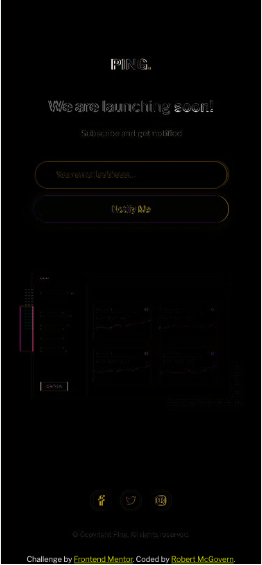
Add basic tags to index.html for header/main/footer, then in main splitting into 3, text headings, form and dashboard illustration.
Q should the copyright be added to the footer or the bottom of the main????
Started mostly with mobile
spent the morning struggling to get flex to work the way I wanted. Got there but also realised that I didn't need to use it the way I did. facepalm
Continue to play with positioning rather than focusing on main styling
Nudge screenshot nudge screenshot nudge screenshot sigh I'm not OCD I swear ...
Realised better to social icons into footer and move the footer out of the flex container, and clamp it to the bottom.
So mobile is virtually there. The Ping! logo is slightly off, as is the "We are launching soon!" So close sigh
Day break
Spent 20 minutes playing with mobile positioning. Crazy I know, but its like near spot on.
