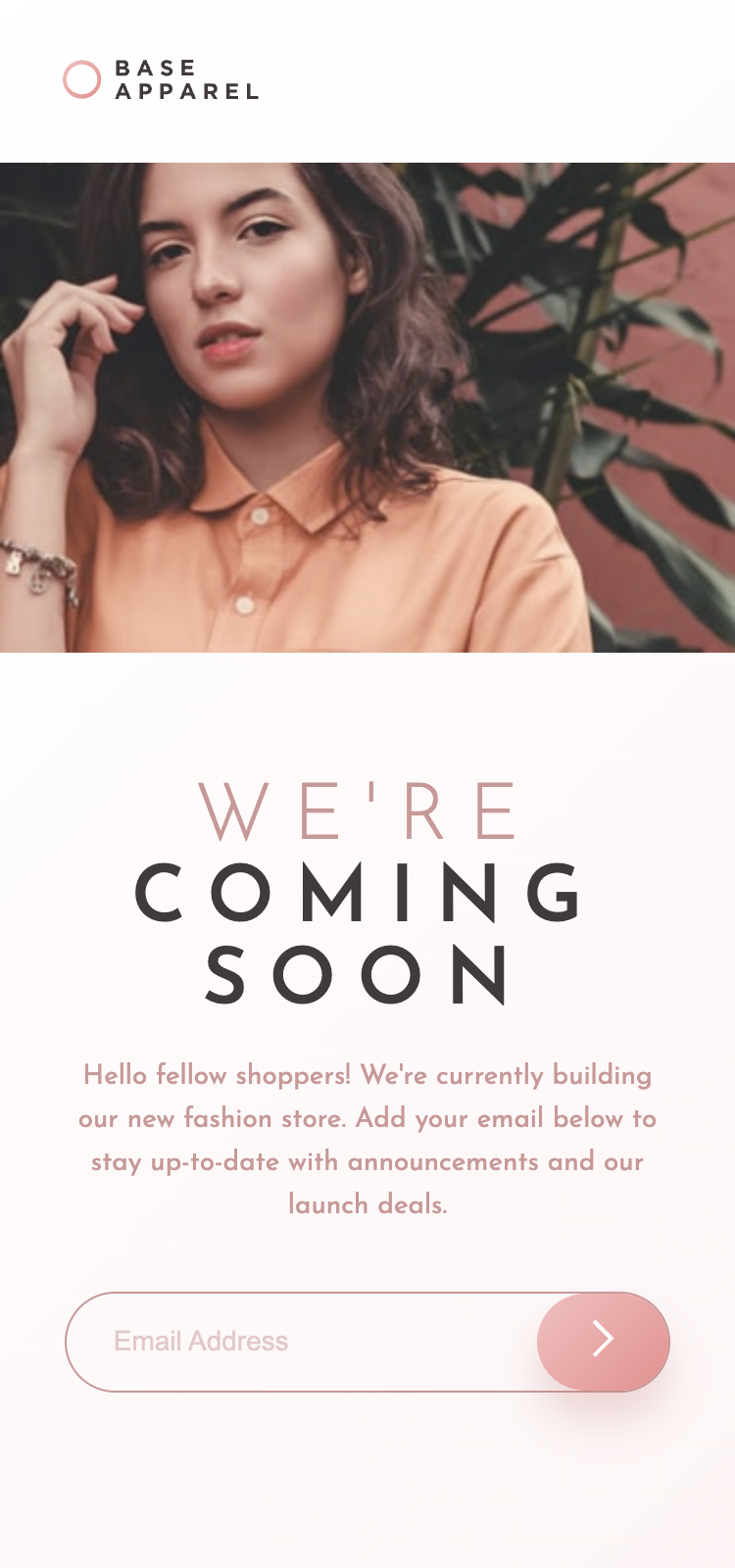
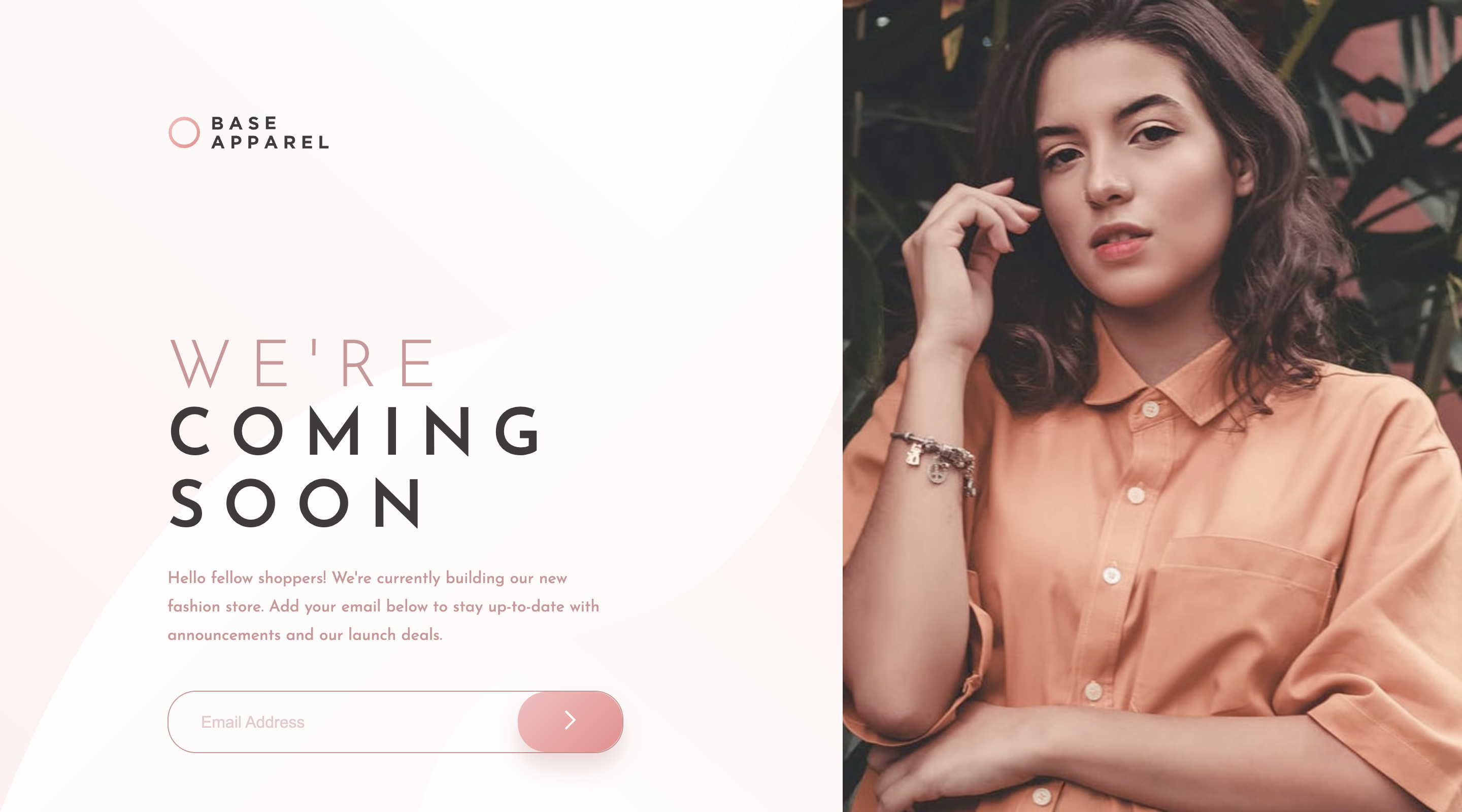
2.7 KiB
Frontend Mentor - Base Apparel coming soon page solution
This is a solution to the Base Apparel coming soon page challenge on Frontend Mentor. Frontend Mentor challenges help you improve your coding skills by building realistic projects.
Table of contents
Note: Delete this note and update the table of contents based on what sections you keep.
Overview
The challenge
Users should be able to:
- View the optimal layout for the site depending on their device's screen size
- See hover states for all interactive elements on the page
- Receive an error message when the
formis submitted if:- The
inputfield is empty - The email address is not formatted correctly
- The
Screenshot
Links
- Solution URL: on GitHub
- Live Site URL: on GitHub Pages
My process
Built with
- Semantic HTML5 markup
- CSS custom properties
- Flexbox
- CSS Grid
- Mobile-first workflow
What I learned
The element is a container only. The element is the main part describing its contents. only describes different sources. So the alt remains the same for all of them regardless of the source.
https://stackoverflow.com/a/48207973
I learned that I'm not good at handling input fields with a button and an error image.
Continued development
I want to go through other peoples solutions for how the handled the input and the adjacent button and error image. I'm sure there is a better solution than mine, particularly because mine limits the size of the input field more than it should.
Useful resources
- Stackoverflow Visually Hidden answer - I found this useful for doing adding the label but making it visually hidden.
Author
- Website - Robert McGovern Blog
- Frontend Mentor - @tarasis
- Twitter - @tarasis
Acknowledgments
My thanks to Julio Cinquina on the FEM Slack for correcting my misunderstanding of the :has pseudo-class.

