3.6 KiB
Starting 2020-09-23 (22:49)
Well a little under 2 hours later, I've made zero progress on this project BUT I have set up a basic style for the top level project index page. Wasn't what I intended to do, but I'm actually glad I did. Intention is for it to develop and become more interesting/complex as I learn more.
Last to days lost doing nothing. Spent part of today trying to find the perfect VSCode Code theme. None really quite right, don't want to create my own. Whatever it is must have different colouring for IDs and classes in css and the units should be a different color than the number.
Interesting but not quite there
Tokyo Night - I find the Classes/ID slightly too bright compared to the attributes (green vs purple-blue)
ReUI Mirage (React) (want darker background)
Panda Syntax
Palenight Theme - issues
Night Owl
Monokai Dark Soda
Gruvbox Dark (Hard)
Firefly Pro -
Dark Chrome DevTools - really nice, but JS REGEX is too hard to read
2020-09-26
Added basics to the style.css from the style guide.
Again I'm setting the root font to 20px to make working with REM easier.
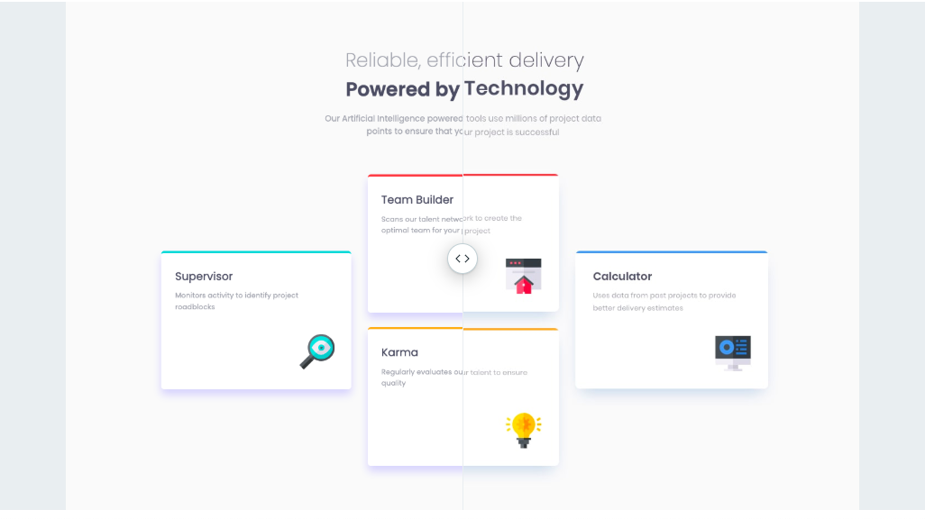
I think the best approach for this is a flex container with
top row: The title, sub title and blurb.
middle row: Is also a flex container, with 3 columns (in destkop) for the cards.
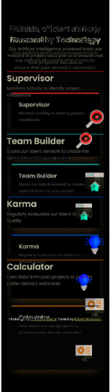
First column is Supervisor
Second column is Team Builder and Karma
Third column is calculator.
bottom row: attribution? (might just delete it)
Added tags & classes to index.html.
Don't think I really need the classes for inside card (card-title, card-blurb, card-image). In theory that could just be handled with card h1 {} or card p {} or card img {}
Layout looks like this right now
.png)
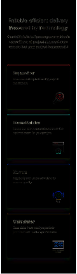
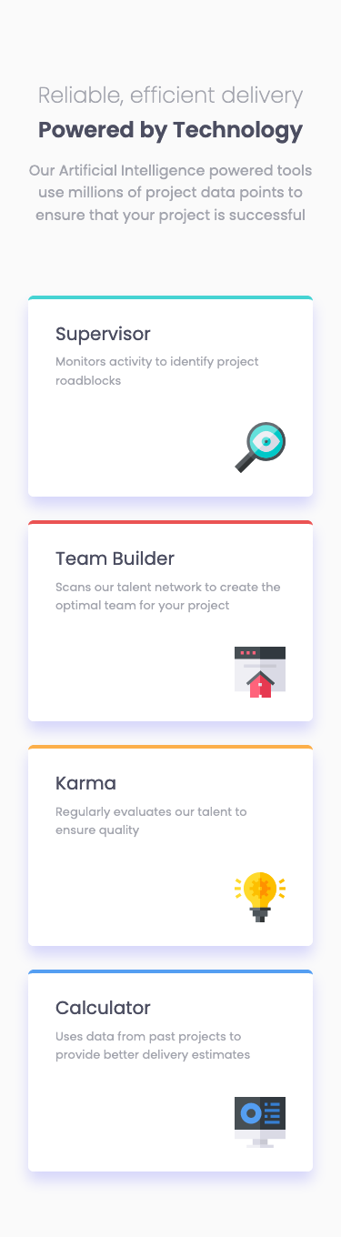
Added some styling, working of the mobile design and building it up. Lots of touch ups required yet, improve shadow, spacing, shrinking icons, but its taking shape.
My card titles and card blurbs are too big. Probabl h3 rather than h1, font size is a guess. Icons are also a little big, although its not far off 75% rather than 100%? (Prob should pay for the Pro frontend Mentor sub to stop having to guess, but its part of the challenge for me too.)
2020-09-27 15:05
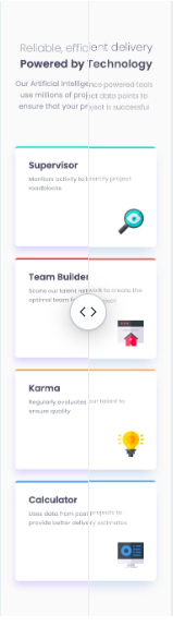
Picking up from yesterday. 38 minutes later. Mobile is virtually exact apart from shadow on the cards. Basically bits of tweaking to fit. Not a horrendous amount. Havent looked at how it looks on desktop yet :)
So how to judge what the shadow should be? what is the trick to that? Basically experimentation it seems.
14 minute break ...
Have to work out how close the desktop is, once I put in columns. Right now, its not close :)
Forgot to note when I restarted work. Around 40 minutes ago. Didn't require too much tweaking to get in nearly in place. Not going to spend too long trying to finese it.
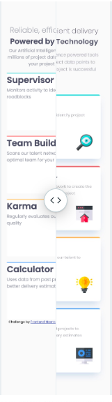
And these are the final images.
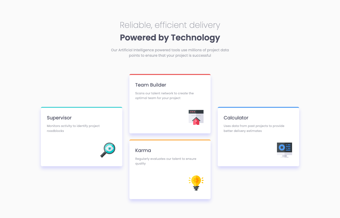
As per usual the in between state is not ideal, at the transition point the boxes are too big. It was wrong to use a % on the icon images. They become too big before the transition to the desktop form.
May have run into a browser difference. Previously I had thinks lined up in the mobile section, but when I was in a different browser, I had to nudge the top section up 3 pixels.