6.5 KiB
notes on how i approached this
downloaded
read readme
read style guide
created css file
added it to the html file
added font awesome to the html file
added fonts to the css file
added initial styling (fonts, background color, background image)
in html file I
added header
added divs for sections (logo, middle, social media buttons)
put divs around existing content (text for right side)
added logo
added mockup image
added icons for social media
saved it out
moved on to css
adjust positioning based on how it looks on design
got things roughly in position.
pause for bed, however curious how I am in relation to design file
realise I really can't match 1440x800 because the laptop I'm using is only 1366x768 (originally thought it was 2560x1440, page said only 1440 ... easy mistake. Had to look at design image for res)
go to sleep
next morning I realise
chrome in developer mode allows you to create devices of specific resolutions
set up 2, one 1440x800 and the other 375x800
I can then save out the image and use diffchecker.com and use the design image vs the current image of the page to compare and see how close I am. You can use a diff mode that only shows the differences (mostly in green) which makes it easier to adjust.
Now, now I need to finish styling for desktop ...
remainder of day lost to calls and roleplaying
next day
download diffchecker trial rather than keep using website
adjust size of logo svg
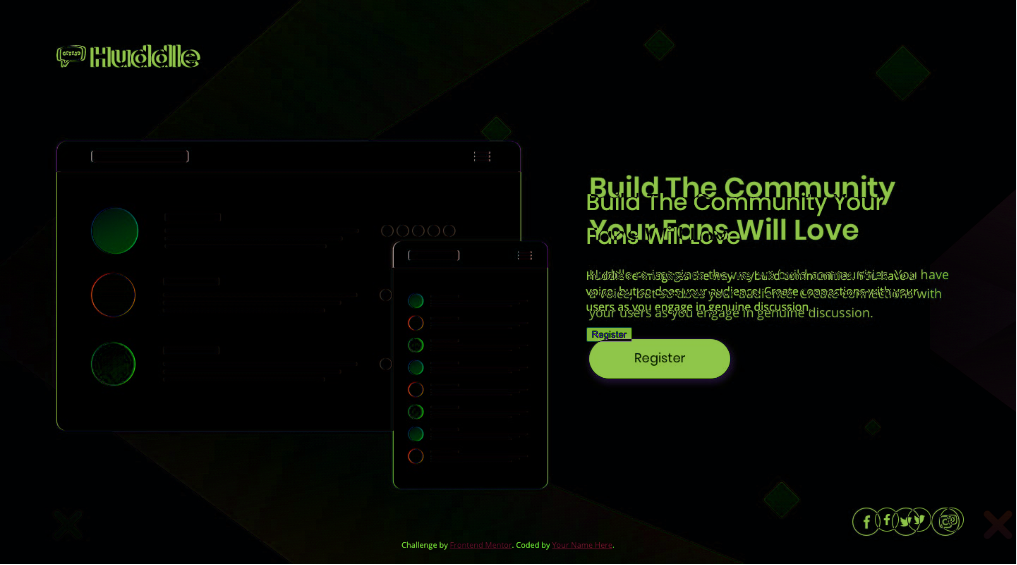
play with positioning using margin and rem. Logo and mockup images are so close at this point (see image diff 1)
 realise I probably should be using % rather than rem for margin positioning
also should probably be using 0 positioning in body and doing it in each element
tweaked logo and mid section margins mixture rem & % for the moment
set body to have 0 margin
seemingly no changes are made with % unless they are to a pixel, so 4.86 is the same as 4.8611111, need to go to next px % which is 4.7916666667
then lots and lots of iterating. Making changes and comparing in diffchecker against the design doc.
Spent 2 hours+ on this. Too long.
Still haven't quite nailed the blurb section.
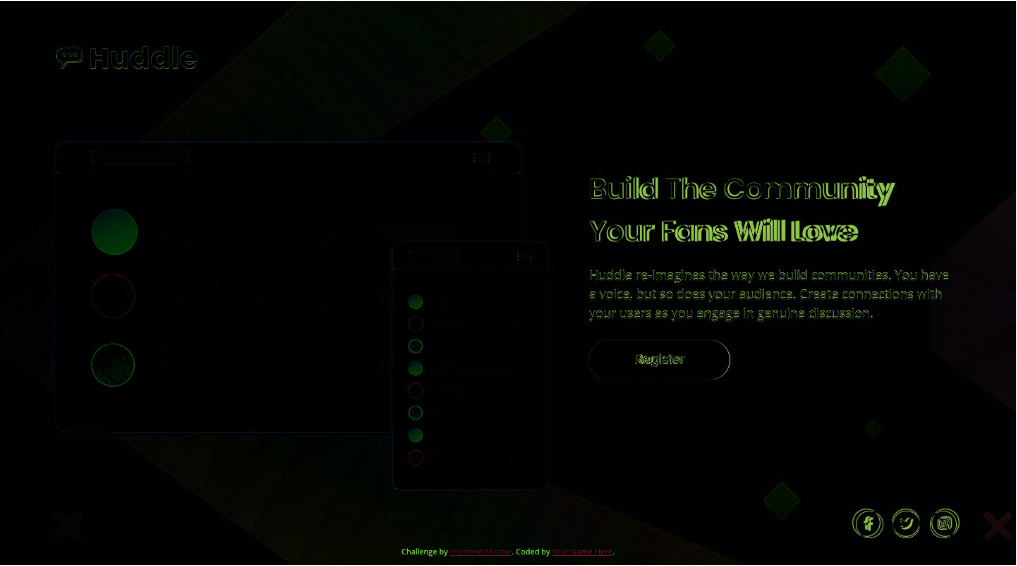
Basically the logo is slight off
the differences between the mockup and symbols are image quality between jpg and png
its like a pixel off with the social media buttons
img-diff-2-desktop-near-enough.png
realise I probably should be using % rather than rem for margin positioning
also should probably be using 0 positioning in body and doing it in each element
tweaked logo and mid section margins mixture rem & % for the moment
set body to have 0 margin
seemingly no changes are made with % unless they are to a pixel, so 4.86 is the same as 4.8611111, need to go to next px % which is 4.7916666667
then lots and lots of iterating. Making changes and comparing in diffchecker against the design doc.
Spent 2 hours+ on this. Too long.
Still haven't quite nailed the blurb section.
Basically the logo is slight off
the differences between the mockup and symbols are image quality between jpg and png
its like a pixel off with the social media buttons
img-diff-2-desktop-near-enough.png
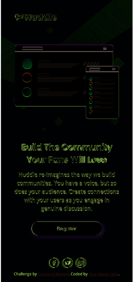
 Still now on to the mobile variant. Can I nail it better?
spent an age on this, lots of tweaking. Not quite there but nearly, so nearly
Still now on to the mobile variant. Can I nail it better?
spent an age on this, lots of tweaking. Not quite there but nearly, so nearly
 submit to frontend mentor as a solution
Couple of days later So I had a 3 responses on Frontend Mentor page 1 Comment on Slack 2 responses on Twitter. less than I hoped but some useful information to take on board
- First: Don't worry about it being so exact(!!), being a little off/up/down/font off doesn't really matter ... ALTHOUGH it CAN pay off to be exact. Theoretically you are hired to implement the required design, so best to be as exact as possible.
Second: Link color in the attribution is impossible to read. My fault for not making any changes to it.Third: mobile design - make icon size 13x13, that will fix centering- Fourth: mobile design - the hit box for the link is off from the image/circle
- fifth: look at stacked icons on font awesome https://fontawesome.com/how-to-use/on-the-web/styling/stacking-icons
sixth: hover state for social icons not a good color. Aim for a lighter violet. Aim to stay in color scheme (important for accessibility)- seventh: good not used too much css, nor complex structure
eighth: "personal pet peeve" html button is only valid in an html form, otherwise use a anchor styled as a button because a button has no href.-- Not sure which way to go with this because its not clear what would happen on the button press. Does it go to a new page, or reveal a email submission box- ninth: "personally I would have wrapped the social icons and the footer links in a combined foot section just because that makes them easier to move later if doing a whole site". Mixed on this, attribution link at bottom was not part of the original design, but was part of the base files, and is something that was deletable.
- tenth: (overall people though I did a good/awesome job)
- eleventh: was told to check out PerfectPixel extension for Chrome/Firefox. Similar job to diffchecker, can use to add a design image as a layer and you can see how off you are from the design ... being by opacity or there is a difference view
- twelfth: documenting the process was apparently helpful ("its something not everyone does, but should")
- thirteenth: Design probably means in wide formats that the page should cover all the screen. Both in height and width. That is more powerful than image should be at X/Y, should be this tall. Text should also be at X/Y and be a certain size, with certain spacing between letters/lines.
- fourteenth: Limit the width of the components, and contain them to the center of your screen.
- fifteenth: At present if you go really wide on the page, the text will appear in only one line. It totally loses its expected design. Use a main container to hold everything inside it. Limit its size and automatically center it.
- sixteenth: I've used flexbox but some of the child elements are not restricted in the size they can take. This si useful to maintain proportions at different sizes. (Good example is the mockup image, which takes up more space than it should in the sizes between roughly 500-800px)
- seventeenth: Basically ... try not to restrict your designs to two resolutions. Make it work for in-between widths.
Bit of a delay but started to work through the changes above. Was going to use the global selector to set Margin to 0, but it didn't work as I expected and from what I read its generally recommended not to use it.
Made tweaks to mobile css, that made it work better between intended design sizes (375x800 and 1440x800). However that temporarily messed up 1440x800 design.
Made tweaks to the desktop CSS and while its not quite as close as before I think it will do. Switched so that the transition occurs for phones and tablets to 1100 pixels BUT that has the drawback that the logo is too small and the background image is in the wrong place. (and argulably the mockup is a little big).
I should work on it a bit further, but honestly thats enough for now. Next challenge.