2.6 KiB
Frontend Mentor - 3-column preview card component solution
This is a solution to the 3-column preview card component challenge on Frontend Mentor. Frontend Mentor challenges help you improve your coding skills by building realistic projects.
Table of contents
Note: Delete this note and update the table of contents based on what sections you keep.
Overview
The challenge
Users should be able to:
- View the optimal layout depending on their device's screen size
- See hover states for interactive elements
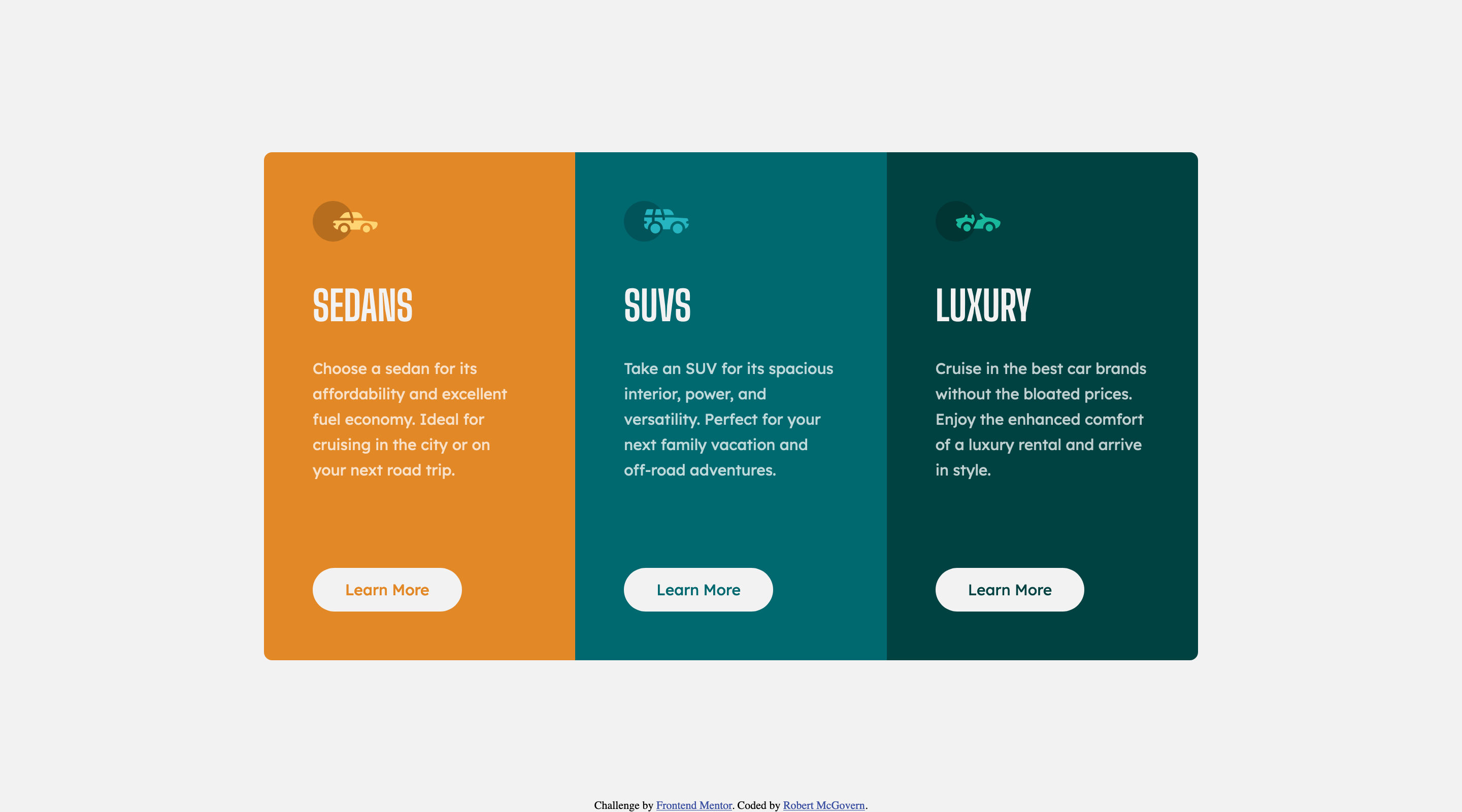
Screenshot
Here are the final images for the desktop version
and for the mobile version

Links
- Solution URL: Gitea on rmcg.dev
- Live Site URL: rmcg.dev
My process
Built with
- Semantic HTML5 markup
- CSS custom properties
- Flexbox
- Mobile-first workflow
What I learned
I was rusty as I hadn't touched html/css/javascript in 7 months. Solution came together fairly quickly.
As usual I focused on mobile first, and then added some minor tweaks for desktop. (Specifically the "Learn More" button is lower on the desktop version)
I spent a little time chasing box widths, mainly it was paragraph width. Honestly I should have simply stayed with the 25ch used for the mobile version rather than having 23.15ch for the desktop.
Continued development
Continue working through the newbie projects that I have, with an eye to trying to use grid rather than flexbox.
Author
Acknowledgments
Just Matt front Frontend Mentor for creating the site. These challenges have been an effective way of learning.